Numbers on a screen do not change behavior. A chart that shows your dining spending climbing for three straight months does. That is the difference between expense tracking and expense understanding: one records data, the other reveals patterns you can act on.
The best expense tracking apps with charts and visualizations go beyond listing transactions. They turn your raw spending into pie charts, bar graphs, trend lines, and category breakdowns that make financial patterns obvious at a glance. Some apps excel at this. Others treat analytics as an afterthought, burying a single chart behind three menu taps.
We tested six popular expense trackers and evaluated each one specifically on its visual reporting and analytics capabilities. If you are looking for a broader comparison of tracking features, see our full expense tracker roundup for 2026.
Why Spending Visualizations Matter
A spreadsheet full of transactions tells you what happened. A chart tells you what is happening: the trends, the outliers, the categories quietly eating your budget.
Visual analytics help in three specific ways:
- Pattern recognition: Humans process visual data faster than tables. A bar chart showing monthly grocery spending makes a rising trend obvious in a way that twelve numbers in a column do not.
- Category awareness: Pie charts and donut charts reveal how your spending is distributed. You might think transportation is your biggest expense, then see a chart that shows subscriptions have overtaken it.
- Accountability over time: Trend lines across weeks or months show whether your habits are improving or drifting. A single month is a snapshot. Six months of trend data is a story.
For a deeper look at using analytics to improve your finances, read our guide on financial analytics.
How We Evaluated Chart and Visualization Features
Every app was tested over at least two weeks of real daily spending. We focused specifically on:
- Chart types available: Pie, bar, line, donut, Sankey, heatmaps, and other visual formats
- Customization: Can you filter by date range, category, or payment method within charts
- Dashboard design: How quickly you can access visual summaries from the home screen
- Export options: Can you download or share charts and reports
- Date range flexibility: Daily, weekly, monthly, yearly, and custom ranges
- Mobile experience: How well charts render and interact on a phone screen
Quick Comparison Table
| App | Price | Chart Types | Dashboard | Date Range Filters | Export | Offline Charts |
|---|---|---|---|---|---|---|
| Finny | $1.99/mo | Pie, bar, trend lines, net income | Yes | Daily/weekly/monthly/yearly/custom | CSV | Yes |
| Monarch Money | $14.99/mo | Pie, bar, Sankey, line | Yes (customizable widgets) | Custom ranges | Chart download | No |
| Copilot | $13/mo | Bar, line, spending snapshots | Yes | Monthly | Limited | No |
| YNAB | $14.99/mo | Bar (budget vs. actual) | Yes | Monthly | Reports only | No |
| Spendee | Free/$2.99/mo | Pie, line, category breakdowns | Yes | Monthly/yearly | PDF, CSV | Partial |
| Wallet by BudgetBakers | Free/$4.49/mo | Pie, bar, line, category flow | Yes | Weekly/monthly/custom | CSV, PDF | Partial |
The Best Expense Tracking Apps for Charts and Visualizations
Monarch Money: Best Overall Visualization Suite
Monarch Money has the most comprehensive visualization toolkit of any personal finance app in 2026. The standout feature is the Sankey diagram: a flow chart that visually maps how your income moves through categories and out as expenses. It is the kind of chart that makes you stop and stare at where your money actually goes.
Beyond the Sankey diagram, Monarch offers pie charts and bar graphs for spending by category, merchant, or group. You can toggle between total amounts and change over time. Every chart includes filtering by date range, category, merchant, account, tags, and amount, which means you can drill into very specific questions like "how much did I spend on restaurants in February versus January."
The dashboard is fully customizable with drag-and-drop widgets. You can surface net worth, recent transactions, investment performance, and spending breakdowns on your home screen. Charts can be downloaded for sharing or further analysis. Saved reports let you revisit favorite views without rebuilding filters each time.
Monarch also includes an AI assistant that can answer natural language questions about your spending, pulling insights directly from your connected accounts.
The trade-off is price and privacy. At $14.99 per month ($99.99/year), Monarch is among the most expensive personal finance apps. It requires bank connections to function, which means no offline capability and sharing your financial credentials with a third party.
Best for: People who want the richest possible visual analytics and do not mind paying for bank-linked tracking.
Chart highlight: Sankey diagram for income-to-expense flow visualization.
Copilot: Best Visual Design for iOS
Copilot has arguably the most polished visual design of any finance app on iOS. The spending insights and monthly snapshots are clean, well-organized, and genuinely pleasant to look at. Charts use smooth animations and a consistent color palette that makes data easy to read.
The app generates automatic monthly spending snapshots that break down your expenses by category with bar charts and percentage comparisons. It highlights unusual spending and shows you how categories changed month over month. The categorization engine learns your preferences over time, which improves chart accuracy as you use the app.
Where Copilot falls short compared to Monarch is depth. You get spending summaries and category breakdowns, but the filtering and customization options are more limited. There is no Sankey diagram, no custom date ranges beyond monthly, and exporting options are restricted. The charts are beautiful but not as interactive as power users might want.
Copilot requires bank connections and is iOS-only. At $13 per month ($95/year), it sits firmly in the premium tier.
Best for: iOS users who value aesthetic design and want clean, automated spending insights without extensive customization.
Chart highlight: Monthly spending snapshots with category-by-category visual comparisons.
YNAB: Best Budget-vs-Actual Reporting
YNAB (You Need a Budget) takes a different approach to visualization. Instead of general spending charts, its visual reporting centers on the gap between what you planned to spend and what you actually spent. This budget-versus-actual view is the core of its zero-based budgeting methodology.
The spending report shows bar charts for each category, with green and red indicators for under and over budget. The income versus expense report tracks your overall financial direction over time. The net worth report charts your long-term wealth trajectory.
These reports are functional rather than flashy. YNAB does not try to impress with Sankey diagrams or animated transitions. It gives you the data you need to answer one question: am I sticking to my budget? For people who follow zero-based budgeting, this focus is a strength, not a weakness.
The limitation is flexibility. YNAB charts are tied to its budgeting framework. If you want free-form spending analysis by merchant, tag, or custom date ranges, the reporting tools feel restrictive. The app also requires bank connections and an internet connection. At $14.99 per month ($109/year), it is the most expensive option on this list.
Best for: Zero-based budgeters who want visual confirmation that they are staying within their planned spending.
Chart highlight: Budget-vs-actual bar charts with green/red category indicators.
Spendee: Best Free Visualization Experience
Spendee's strongest feature is its visual presentation of spending data, and it delivers a surprising amount of chart capability in its free tier. The main overview screen provides a color-coded snapshot of spending categories with pie charts and line graphs. You do not need to dig through menus to find your analytics: they are front and center.
The free version includes a line chart of income versus spending over time and a pie chart breakdown by category. The premium tier ($2.99/month) adds shared wallets, bank sync, and more granular analytics. The category breakdowns are among the most visually appealing of any app, using clear color coding and proportional displays that make spending distribution immediately obvious.
Spendee works across iOS and Android, supports multiple wallets, and allows manual entry without bank connections. The budget feature ties directly into the visual reports, so you can see spending against limits in chart form.
The app is less powerful than Monarch or Copilot for deep analysis. Filtering options are basic, and you cannot create custom reports or save views. But for a free or low-cost app focused on visual clarity, Spendee punches above its weight.
Best for: Users who want clean, accessible spending charts without paying a premium subscription.
Chart highlight: Color-coded category pie charts on the main overview screen.
Wallet by BudgetBakers: Best for Cross-Platform Reporting
Wallet by BudgetBakers offers one of the most flexible reporting systems in the category, especially for users who track finances across Android, iOS, and the web. The app includes pie charts, bar charts, line graphs, and category flow reports. Budget views show spending against limits with clear visual progress bars.
The premium tier adds predictive analytics and detailed category-wise reports with percentage changes, making it easy to spot where spending is growing or shrinking. Weekly reports summarize your financial activity and highlight trends you might have missed. The app connects to over 15,000 banks worldwide, which is the widest bank coverage on this list, particularly strong in European markets.
Machine learning helps categorize transactions automatically over time, improving the accuracy of your charts and reports. You can export raw data via CSV or PDF to build custom visualizations in other tools.
The free tier is functional but limited in analytics depth. Premium costs $4.49 per month. The interface, while data-rich, is not as polished as Copilot or Monarch, and some chart interactions feel cluttered on smaller phone screens.
Best for: Cross-platform users who want detailed financial reports and broad international bank support.
Chart highlight: Weekly summary reports with category percentage changes and trend indicators.
Finny: Best for Offline Charts and Fast Input
Finny approaches spending visualization differently from the bank-linked apps above. Because it is built around manual and AI-powered input rather than bank connections, every chart reflects data you have actively tracked: nothing falls through the cracks because a bank sync missed a cash purchase or peer-to-peer payment.
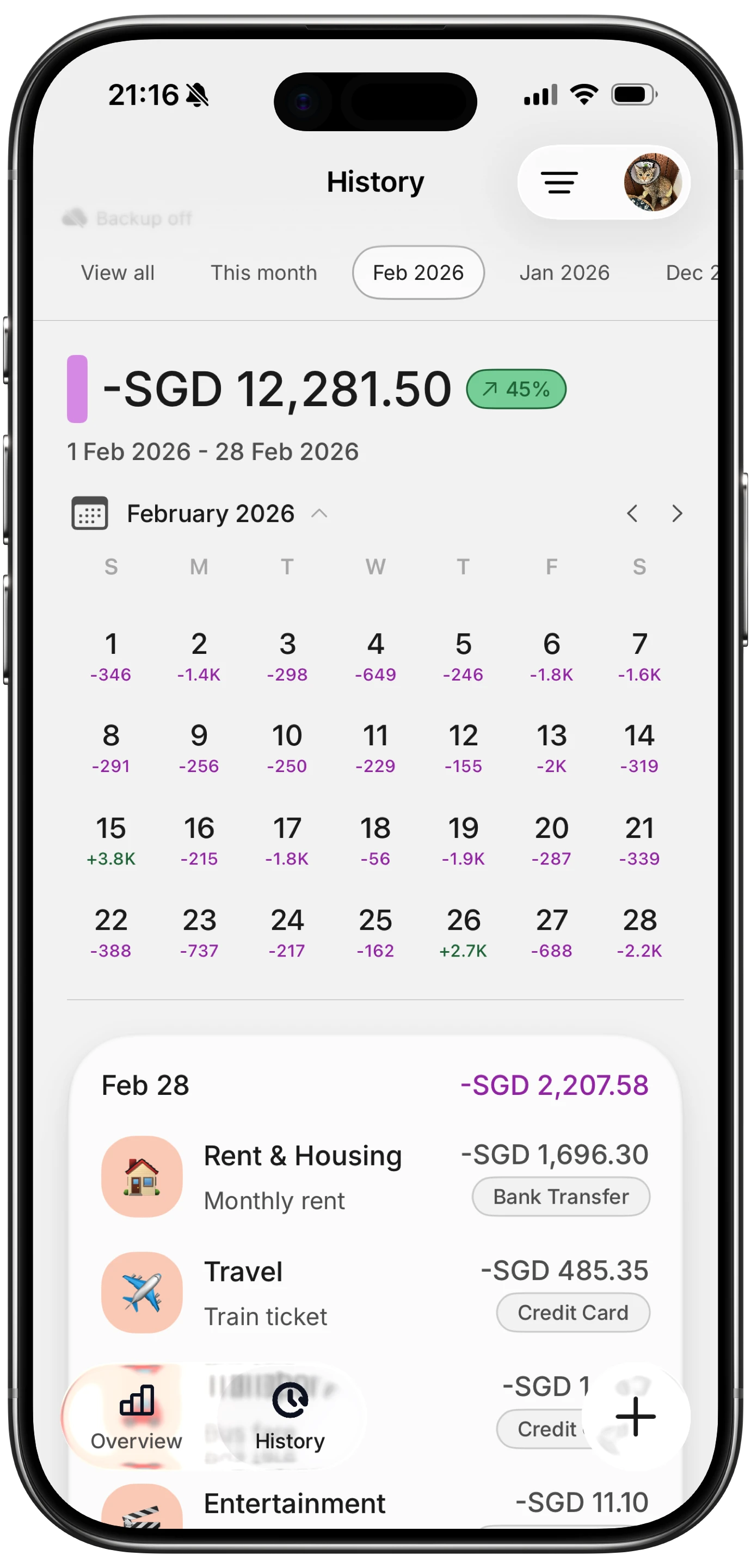
The dashboard includes a net income chart, expense breakdown in pie and bar formats, and trend lines across configurable date ranges. You can view analytics by day, week, month, year, or custom periods, all accessible by swiping through the main dashboard. The calendar view in transaction history provides a visual map of spending density across the month.
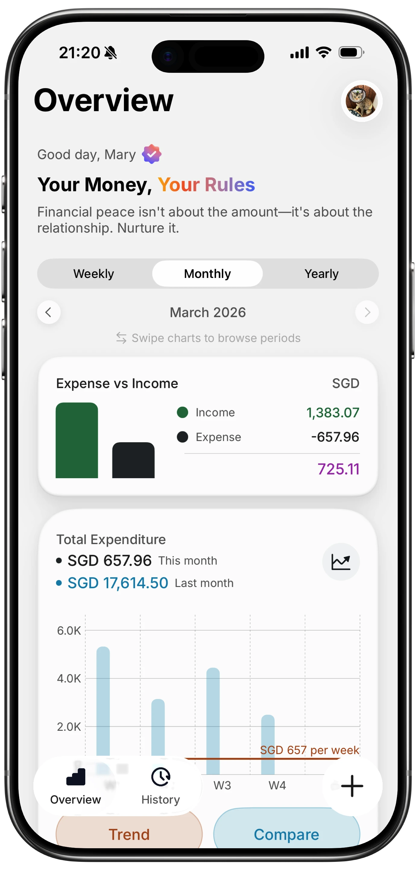
What sets Finny apart from every other app on this list is that charts work fully offline. If you are traveling without service or prefer not to connect your bank accounts, your analytics are still available and up to date. Combined with Tap to Track (which auto-logs Apple Pay transactions instantly) and AI input that handles text, voice, receipts, and statement screenshots, the data feeding your charts stays comprehensive without requiring bank credentials.
At $1.99 per month ($17.99/year), the price difference compared to Monarch, Copilot, or YNAB is significant: roughly one-seventh the cost. For anyone who wants solid visual spending analytics without the premium price tag, Finny delivers the essentials without locking core features behind an expensive subscription.
Best for: Users who want offline-capable charts, AI-powered input, and affordable pricing.
Chart highlight: Swipeable date range views with net income and category breakdown charts.
What to Look for in Expense Tracking Charts
Not every chart feature matters equally. Here is what separates useful visualizations from decorative ones.
Category breakdowns over totals
A chart that says "you spent $3,200 this month" is less useful than one showing $1,100 went to rent, $620 to groceries, $380 to dining, and $340 to subscriptions. Category-level breakdowns are the minimum requirement for useful spending analytics. Every app on this list provides them, but the depth varies significantly.
Time-based comparisons
Spending in isolation means little. Spending compared to last month, last quarter, or last year reveals trends. Look for apps that let you overlay or compare date ranges side by side. Monarch and Wallet by BudgetBakers handle this well. For a practical walkthrough of month-over-month analysis, see our guide on how to compare monthly spending.
Filtering and drill-down
Can you filter charts by merchant, category, account, or tag? The difference between "you spent $600 on food" and "you spent $600 on food, of which $340 was Uber Eats" is the difference between awareness and action. Monarch leads here with its multi-filter approach.
Mobile-first design
Most expense tracking happens on phones. Charts that look great on a desktop dashboard but become unreadable on a 6-inch screen fail the usability test. Copilot and Finny are the strongest here, with charts designed specifically for mobile interaction.
Charts Alone Do Not Fix Your Finances
Visual analytics are a tool, not a solution. A beautiful Sankey diagram will not reduce your spending by a dollar unless you use the insights to change behavior.
The apps that help most combine clear visualizations with practical features: budget limits that tie into chart data, alerts when categories spike, and easy ways to act on what you see. If you see your dining spending climbing, the next step is adjusting your spending categories or setting a category limit: not just admiring the chart.
The best approach is to review your visual reports weekly. Spot what changed, ask why, and decide whether to adjust. For advice on building this habit, see our guide to the best money tracker app in 2026, which covers workflow tips alongside app features.
Frequently Asked Questions
Which expense tracker has the best charts for free?
Spendee offers the strongest free visualization experience with pie charts, line graphs, and color-coded category breakdowns available without a paid subscription. Finny also includes dashboard charts, trend lines, and category breakdowns in its core experience, with the full analytics suite available at $1.99 per month, making it the best value if you want more depth without a high price.
Do I need bank connections to get good spending charts?
No. Bank-linked apps like Monarch and Copilot pull data automatically, but apps like Finny generate charts from manually or AI-logged transactions. The advantage of manual input is completeness: cash purchases, Venmo payments, and foreign transactions all appear in your charts, which bank sync sometimes misses.
What is a Sankey diagram in a finance app?
A Sankey diagram is a flow chart that shows how your money moves from income sources through spending categories. The width of each flow line represents the amount, making it immediately visual which categories consume the largest share of your income. Monarch Money is the most well-known finance app offering this chart type.
How often should I check my spending charts?
A weekly review is the sweet spot for most people. Daily checks can create anxiety without enough data to show meaningful patterns. Monthly reviews risk missing trends until they are already established. Set a weekly reminder to open your analytics dashboard, review category changes, and decide if any adjustments are needed.
Can I export charts from expense tracking apps?
It depends on the app. Monarch Money lets you download chart images directly. Wallet by BudgetBakers and Spendee support CSV and PDF exports. Finny supports CSV export and import for full data portability. YNAB and Copilot have more limited export options, typically restricted to report views rather than raw chart downloads.
Start Seeing Your Spending Clearly
The gap between tracking expenses and understanding them comes down to visualization. The right charts turn months of transaction data into patterns you can act on in seconds.
Download Finny to log expenses using AI, receipts, or text. No bank connections, offline support, and full control over your financial data.