
A single month of spending data tells you where your money went. Two months of data start telling you a story. Three or more months reveal patterns that one snapshot never could: seasonal changes, categories that are quietly growing, and whether your financial habits are moving in the right direction.
Most people check their expenses at month-end, nod or wince, and move on. They rarely place this month next to last month and ask: what changed and why? That comparison is where the real insight lives.
Compare monthly spending regularly and you gain something budgets alone do not provide: a sense of trajectory. Are you spending more over time or less? Are certain categories climbing while others stay flat? This guide covers why month-over-month comparisons matter, how to do them effectively, and what to look for when the numbers are side by side.
For a broader overview of tracking and analytics, see our financial analytics guide. If you want apps with strong visual dashboards, check our roundup of the best expense tracking apps with charts and visualizations.
Why Comparing Months Matters
Looking at a single month of expenses is like checking your weight once. It gives you a number, but without context, you cannot tell if you are gaining, losing, or holding steady. Monthly comparisons provide the context.
Catching Seasonal Spending
Spending is not uniform across the year. December brings holiday gifts and travel. Summer months often include vacations and higher utility bills. Back-to-school season hits families in August and September.
When you compare months, these seasonal patterns become visible and predictable. Instead of being surprised by a $400 spike in December gifts, you can plan for it because you saw the same pattern last year.
Detecting Lifestyle Creep
Lifestyle creep is the gradual, often invisible, increase in spending that follows income growth or simply the passage of time. Your dining budget was $250 three months ago. Now it is $340. No single month felt extravagant, but the trend is clear when you line up the numbers.
Without month-over-month comparison, lifestyle creep operates undetected. With it, you spot the drift early enough to decide whether the increase is intentional or accidental.
For more on building awareness around spending patterns, see our guide on building money habits.
Measuring Budget Progress
If you set a goal to reduce discretionary spending by 10%, how do you know if it is working? Monthly totals alone do not tell you much. Comparing this month to the month before your goal started gives you a clear progress report.
The same applies to savings rate improvements, debt payoff acceleration, or any financial target. Trends require at least two data points.
How to Compare Monthly Spending: Two Approaches
The Spreadsheet Method
Spreadsheets give you full control but require manual work. Here is a basic structure:
| Category | January | February | March | Change (Feb to Mar) |
|---|---|---|---|---|
| Groceries | $380 | $410 | $395 | -$15 (-3.7%) |
| Dining Out | $220 | $280 | $310 | +$30 (+10.7%) |
| Transportation | $150 | $145 | $160 | +$15 (+10.3%) |
| Entertainment | $90 | $120 | $75 | -$45 (-37.5%) |
| Subscriptions | $55 | $55 | $68 | +$13 (+23.6%) |
| Shopping | $180 | $140 | $210 | +$70 (+50.0%) |
| Total | $1,075 | $1,150 | $1,218 | +$68 (+5.9%) |
To build this:
- Export or collect your categorized expenses for each month.
- Align categories so you are comparing the same things across periods.
- Calculate changes in both dollar amounts and percentages.
- Highlight outliers, any category that moved more than 15-20% deserves attention.
The spreadsheet method works well for people who enjoy detailed analysis. The downside is the time investment. Collecting, categorizing, and formatting data each month takes 30-60 minutes, and most people stop doing it after a few months.
The App Method
Finance apps automate the comparison. Instead of building a spreadsheet from raw data, you open the app and the comparison is already there.
The key features to look for in an app:
- Period overlay: The ability to see current spending alongside a previous period on the same chart.
- Category-level comparison: Not just totals, but breakdowns showing which categories changed.
- Visual indicators: Color coding or directional arrows that highlight increases and decreases at a glance.
Apps remove the friction that kills consistency. When comparisons are automatic, you actually review them.
For a comparison of tools that handle this well, see our best money tracker apps in 2026 guide.
How Finny Handles Month-Over-Month Comparison
Finny's spending comparison chart overlays your current period against the previous period automatically. When you open your analytics, you see two lines or bar sets: one for this month, one for last month. No setup required.
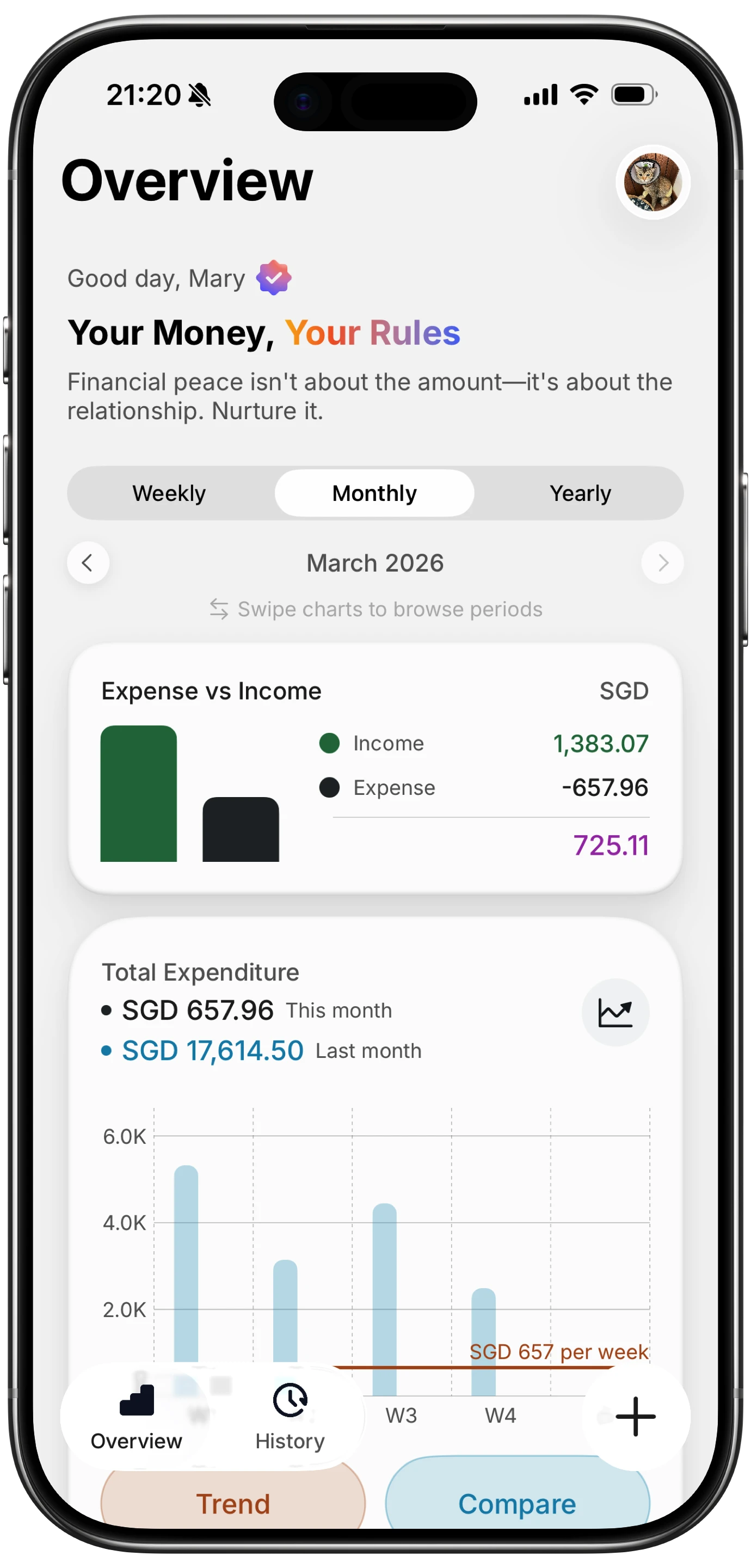
This overlay makes differences immediately visible. A day or week where current spending runs significantly above the previous period stands out on the chart. You do not need to calculate anything or remember what last month looked like.
The category breakdown chart goes a level deeper, showing where your money goes across categories and how the distribution has shifted.
Because Finny uses AI-assisted categorization, your expenses are sorted consistently across months. This eliminates a common problem with manual tracking: inconsistent categories that make comparisons unreliable. A coffee from the same shop should land in the same category every time, and with Finny, it does.
All of this works offline as well. You can review your spending comparisons on a flight, during a commute, or anywhere without internet access. For details on offline capabilities, see our guide on offline expense tracking.
What to Look For When Comparing Months
Having the data is only half the job. Knowing what matters in that data is the other half.
Categories That Grew Without a Reason
Some spending increases are intentional. You signed up for a new gym membership, or you moved to a more expensive apartment. These are decisions you made consciously.
The concerning increases are the ones you did not decide. Dining out crept up by $80. Shopping increased by $100. These often happen through accumulated small purchases that individually feel harmless.
When you spot an unexplained increase, review the individual transactions in that category. You will usually find a pattern: more frequent takeout orders, a new online shopping habit, or subscriptions you forgot about.
For strategies on managing subscription costs specifically, check our post on best free budgeting apps in 2026.
Recurring Monthly Spikes
Some expenses spike on the same schedule. Quarterly insurance payments. Annual subscription renewals. Biannual car maintenance. If you see a large expense in March and another in June, you may be looking at a quarterly bill.
Document these patterns. Once you know a $300 insurance payment hits every three months, you can set aside $100 monthly so the spike does not disrupt your budget. This is the sinking fund approach, and monthly comparisons are what reveal the need for it.
Your Savings Gap Trend
Compare not just spending, but the gap between income and spending each month. This gap represents your savings capacity.
| Month | Income | Spending | Gap |
|---|---|---|---|
| January | $4,200 | $3,650 | $550 |
| February | $4,200 | $3,800 | $400 |
| March | $4,200 | $3,920 | $280 |
In this example, spending is growing while income stays flat. The savings gap is shrinking. Three months of data make the trend undeniable, even though each individual month might seem fine.
Category Ratios
Beyond absolute numbers, look at how your spending distribution changes. If groceries consistently represent 15% of your spending and suddenly jump to 22%, something changed, whether that is food prices, shopping habits, or household size.
Tracking category ratios over time provides a normalized view that accounts for overall spending changes. Even if your total spending increases, the proportions tell you whether the increase is broad or concentrated.
How Often Should You Compare
Monthly comparisons are the baseline. Do them at the start of each new month while the previous month is fresh.
However, different comparison windows serve different purposes:
| Comparison | Purpose | When to Use |
|---|---|---|
| Month vs. previous month | Spot immediate changes | Monthly review |
| Month vs. same month last year | Account for seasonal patterns | Quarterly or annual review |
| 3-month rolling average | Smooth out one-time spikes | Ongoing trend monitoring |
| Quarter vs. previous quarter | Measure medium-term progress | Quarterly goal check |
If you are actively trying to change a spending habit, weekly comparisons within the month can also help. Comparing the first two weeks of this month to the first two weeks of last month tells you early whether your changes are working.
Common Comparison Mistakes
Comparing Months with Different Day Counts
February has 28 days. March has 31. A 10% spending increase from February to March might simply reflect three extra days of expenses. When precision matters, normalize by dividing totals by the number of days in each month to get a daily average.
Ignoring One-Time Expenses
A $1,200 laptop purchase in March does not mean your spending habits changed. Separate one-time or irregular purchases from recurring spending before comparing. Otherwise, you will chase explanations for changes that are not really trends.
Only Looking at Totals
Total spending comparisons miss important shifts. Your total might stay flat at $3,500, but if groceries dropped $200 while dining out rose $200, your habits changed even though the bottom line did not. Always look at category-level data alongside totals.
Not Adjusting for Known Changes
If you moved to a more expensive apartment, your housing costs will spike. This is not a spending problem to solve. Separate known, intentional changes from unintentional drift. The drift is what deserves your attention.
Turning Comparisons into Action
Data without action is just entertainment. Here is a simple framework for acting on what you find:
- Identify the top 2-3 categories that changed the most. Do not try to address everything at once.
- Determine whether each change is intentional or accidental. Intentional changes are decisions. Accidental changes are habits.
- For accidental increases, set a specific limit for next month. Not "spend less on dining out," but "keep dining out under $250."
- Track against that limit throughout the month. Weekly check-ins prevent end-of-month surprises.
- Compare again next month to see if your adjustment worked.
This feedback loop, compare, identify, adjust, verify, is what turns spending data into actual financial improvement.
For deeper strategies on categorizing and managing your spending, see our guide on optimizing spending categories.
The Bottom Line
Comparing monthly spending is one of the highest-value habits in personal finance. It takes minutes, requires no financial expertise, and reveals patterns that single-month snapshots miss entirely.
The method matters less than the consistency. Whether you use a spreadsheet, an app like Finny, or even a notebook, the act of placing two months side by side and asking "what changed?" builds financial awareness that compounds over time.
Start with your last two months. Pull the numbers, compare the categories, and look for one thing you want to change. That is enough to begin. The habit of comparing will do the rest.
Common Questions About Comparing Monthly Spending
How do I compare monthly spending easily?
The simplest approach is using a finance app that provides automatic period comparisons. If you prefer manual methods, export your bank statements to a spreadsheet and organize expenses by category for each month, then calculate the differences.
What spending trends should I worry about?
Focus on categories that are growing without a clear reason. A 5% increase in groceries due to inflation is expected. A 30% increase in dining out because of accumulated habits is worth addressing. Also watch your overall savings gap: if it is shrinking month over month, total spending is outpacing your plan.
How many months of data do I need for useful comparisons?
Two months provide a starting point. Three months reveal trends. Six months or more give you seasonal context. Start comparing as soon as you have two months of data, and the insights will deepen as your history grows.
Should I compare to the same month last year or the previous month?
Both are useful for different reasons. Previous month comparisons catch recent changes and habit shifts. Same-month-last-year comparisons account for seasonal patterns like holiday spending or summer travel. Ideally, review both perspectives during your monthly check-in.
Can I compare spending if my income changed?
Yes, but compare percentages rather than absolute dollars. If you got a raise, your total spending will likely increase. The question is whether it increased proportionally or whether lifestyle creep took more than it should have. Looking at category percentages of income normalizes the comparison.
Ready to compare your spending with clear visual charts?
Download Finny to see your current and previous spending side by side, with automatic categorization and offline support. No bank connections required, just clear data to make better financial decisions.


