
iPhone Home Screen Setup for Budgeting: A 2026 Guide
Your phone is a habit interface. Every app you open, every widget you glance at, and every notification you receive either pushes you toward a behavior or pulls you away from it. When it comes to money, most home screens are designed for shopping, not budgeting.
A deliberate iphone home screen budget setup puts the right information in front of you at the right moment, with as little friction as possible between seeing a number and logging an expense. This guide walks through screen architecture, widget choices, app placement, Focus modes, and Shortcut hooks, all in service of one goal: making it easier to stick to a budget than to ignore one.
Why Home Screen Design Changes Spending Behavior
Behavioral research on habit formation consistently points to two variables: cue salience and response effort. A budget app buried on page four of your home screen has low salience and high response effort. A spending widget on page one has high salience and zero response effort for the first step.
The same logic applies in reverse for shopping apps. If your first home screen has Amazon, Instacart, and a saved-items widget front and center, the cue-to-purchase path is almost frictionless. Moving those apps to a second or third screen adds a small but real friction tax. Over the course of a month, that tax compounds.
This is not about willpower. It is about designing the environment so that the default action, the thing you do on autopilot, is the one that serves your goals. A well-organized home screen does that work without requiring you to make active decisions each time.
For deeper context on how to stop overspending, the home screen setup is one of several environment-design levers worth pulling alongside budget categories and notification rules.
The Four-Screen Architecture for a Money-Conscious Phone
A four-screen structure gives you a clear mental map of what lives where, which reduces decision fatigue every time you unlock your phone.
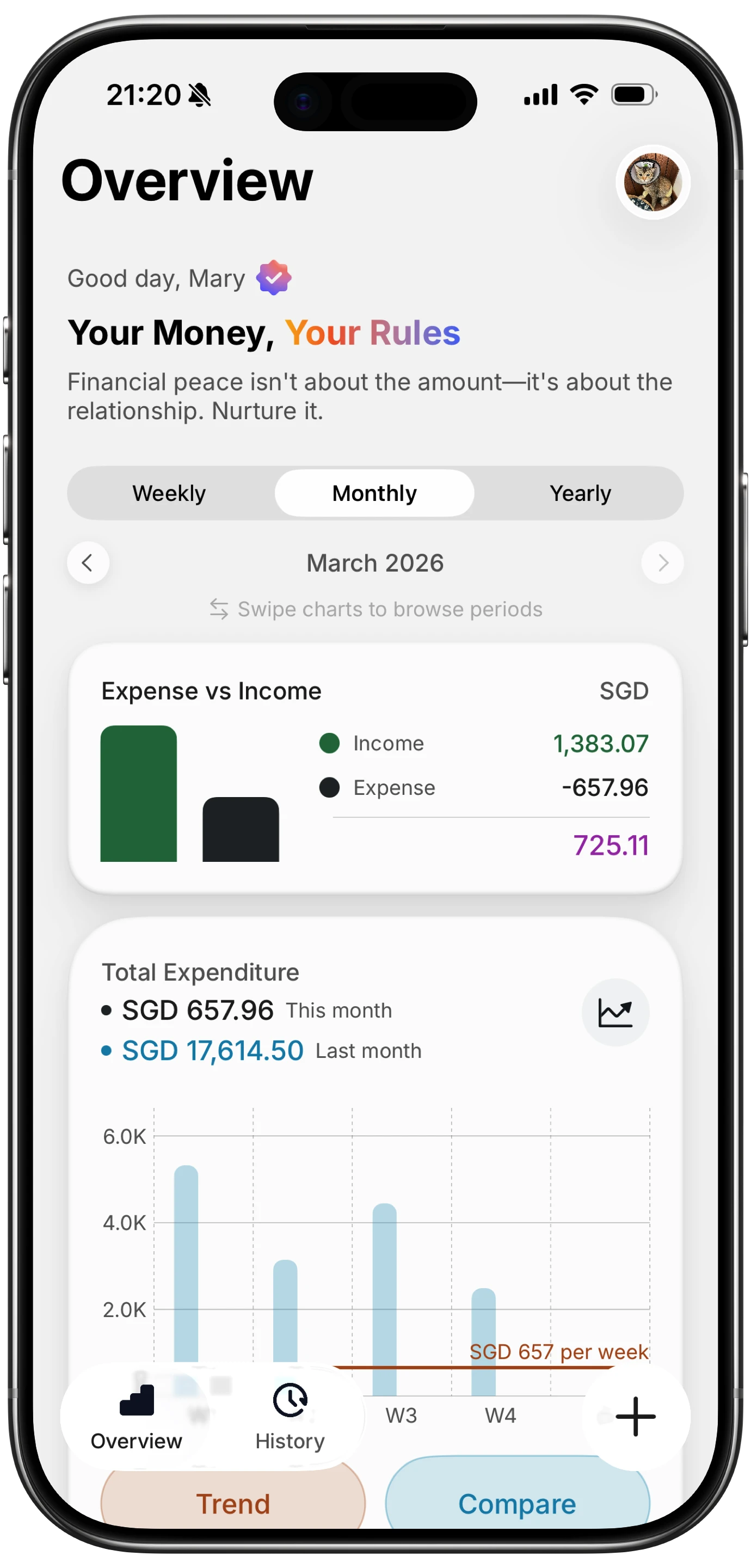
Screen 1: Today. This is your most-used screen. It should contain your expense tracker widget (small or medium), a clock or calendar widget, and the two or three apps you open every single day. No shopping apps. No social feeds. The expense tracker widget here is a constant visual anchor.
Screen 2: Week. A medium or large budget widget showing the current week's spending against your weekly limit. Add apps you use three to five times per week: messaging, maps, transit. Keep it sparse.
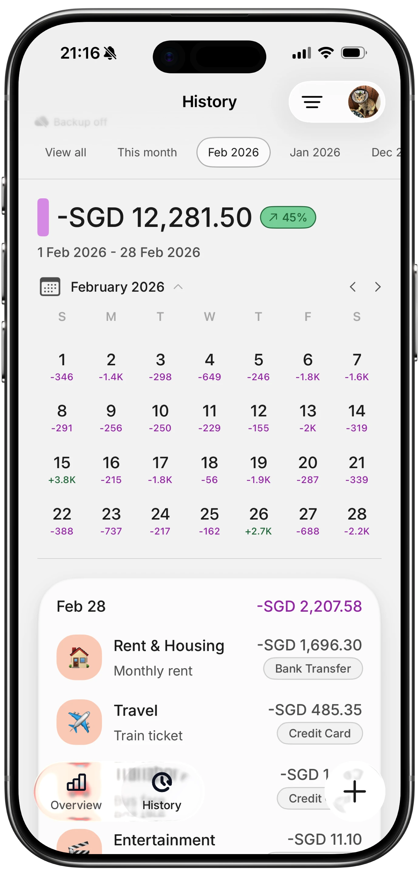
Screen 3: Month. A summary widget or a dashboard view of monthly category totals. This screen is reference material. You check it deliberately, not habitually. Pair it with productivity and reference apps you open once or twice a day.
Screen 4: Settings and Utilities. Everything else. Shopping apps live here. Social media apps live here. The goal is not to delete them, just to make them one extra swipe away so that opening them is a conscious choice rather than a reflexive one.
The App Library, accessible by swiping past your last screen, handles apps you need occasionally but do not want on any home screen at all.
Widget Choices That Actually Work
iOS widgets come in four sizes: small (2x2), medium (2x4), large (4x4), and extra-large (iPad only). On iPhone, small and medium are the most useful for budgeting because they occupy proportional screen space without crowding out other information.
| Widget size | Best use case | Tradeoff |
|---|---|---|
| Small | Quick balance or today's spend | Limited data, glanceable only |
| Medium | Week total with category breakdown | Good balance of data density |
| Large | Full month dashboard | Takes up half a screen |
| Smart Stack | Rotating views from multiple apps | Risk of the budget widget rotating away when you need it |
Smart Stacks are worth mentioning separately. iOS uses on-device intelligence to surface the widget it predicts you want based on time of day, location, and usage patterns. In theory, a budget tracker widget would appear when you are near a coffee shop. In practice, the rotation can feel unpredictable. If you want guaranteed visibility, pin a single budget widget rather than adding it to a Smart Stack. Note that widget refresh rates are controlled by the OS and by each app individually; most budget apps refresh every 15 to 30 minutes in the background, so real-time accuracy varies. Check the documentation for your specific app to understand its update interval.
For a comparison of which apps offer the best widget support, see our best iOS budget apps in 2026 roundup.
App Placement Principles
Placement follows from one rule: make the high-value action easy and the low-value action slightly harder.
For your expense tracker, it should be on Screen 1, ideally reachable by your thumb without shifting your grip. The bottom-left or bottom-right corners of the dock are prime locations on most iPhones. The dock persists across all home screens, so placing your expense tracker there gives you one-tap access from anywhere.
The friction tax concept applies directly to shopping and delivery apps. Moving Amazon or a food delivery app off Screen 1 to Screen 4, or into the App Library entirely, adds one or two taps to the path. That is enough friction to interrupt the autopilot loop and create a moment of deliberate choice.
A secondary principle: keep categories of apps together. Finance apps on Screen 2 or 3 means you build a mental association between that screen and money decisions. Over time, swiping to that screen primes a more intentional mindset before you open anything on it.
If you prefer logging expenses without opening an app at all, the track purchases without opening app guide covers widget-tap and Shortcut-based flows that work alongside this placement strategy.
Pairing With Focus Modes: Spend Mode vs Save Mode
Focus modes, introduced in iOS 16 and refined in subsequent releases, let you define which apps, widgets, and notifications are visible depending on what you are doing. As of iOS 18 and iOS 19 (if applicable to your device in 2026), Focus modes can be triggered manually, on a schedule, by location, or by an app opening. Specific behavior may differ by iOS version; check Settings on your device for the exact options available.
Two Focus mode configurations are particularly useful for budgeting:
Spend Mode. A custom Focus you activate when you are out shopping or at a restaurant. Home Screen 1 shows only your expense tracker and a maps app. Notifications from all other apps are silenced. The goal is to remove distractions and make it frictionless to log what you just bought while you are still standing at the register.
Save Mode. A Focus you run during the last week of the month, or any period when you are consciously pulling back. Home Screen 1 shows your monthly budget widget prominently, the current balance visible without unlocking. Shopping apps are hidden entirely from the home screen during this mode.
Both modes can be set to activate on a schedule. Spend Mode from 11am to 8pm on weekdays if you tend to spend during lunch and after work. Save Mode every Sunday evening as a weekly review cue.
| Focus mode | Trigger | Home screen shows | Apps hidden |
|---|---|---|---|
| Spend Mode | Manual or location | Expense tracker, maps | Social, entertainment |
| Save Mode | Schedule (e.g., last 5 days of month) | Budget summary widget | Shopping, delivery |
For a broader look at Apple Shortcuts for expense tracking automations in 2026, including how Shortcuts can activate or deactivate Focus modes automatically, that guide covers the automation layer in detail.
Action Button and Shortcut Quick-Add
On iPhone 15 Pro and later models, the Action Button replaces the mute switch on the left side of the phone. You can assign it to any Shortcut. For expense tracking, the most effective assignment is a Shortcut that opens a quick-add screen in your budget app directly, bypassing the app's main interface.
Finny supports AI input, which means you can type or speak a natural-language entry like "coffee 4.50" and it parses the amount and category without you selecting from a dropdown. Pairing this with an Action Button assignment creates a two-step logging flow: press button, type amount. Done in under five seconds.
If your phone does not have an Action Button, the equivalent is a home screen Shortcut icon. Create a Shortcut that opens your expense app to the add-transaction screen and place that Shortcut icon in the dock or on Screen 1. It is one more tap than the Action Button, but still faster than navigating through the app manually.
For those who prefer voice-free, typing-free logging, the log expenses without typing guide covers receipt scanning and one-tap category options that complement this setup.
Common Mistakes to Avoid
Over-cluttering Screen 1. More widgets do not mean more awareness. A screen packed with six overlapping widgets creates visual noise and you stop reading any of them. One or two budget-related widgets on Screen 1 is enough.
Notification overload from finance apps. Every spending alert, every promotional email from your bank, every weekly summary push notification competes for attention. Turn off everything except the notifications you will actually act on. For most people that is: over-budget alerts and large transaction flags. Everything else can be reviewed on your own schedule.
Relying on Smart Stack rotation for budget visibility. If your budget widget is in a Smart Stack and another widget rotates to the front during your morning phone-check habit, you lose the visual cue. Pin the widget or place it outside the stack if consistent visibility matters to you.
Wrong widget refresh expectations. Widgets on iOS refresh on a system-managed schedule, not in real time. If you log an expense and expect your widget to update instantly, you may see stale data for a few minutes. This is a system limitation, not an app bug. Plan your layout assuming a 15 to 30 minute lag.
Keeping shopping apps in the dock. The dock is the highest-salience, lowest-friction location on your phone. Filling it with a shopping app is the structural opposite of what a money-conscious home screen needs.
For a broader look at tracking purchases without friction or choosing among the best budget planner apps in 2026, those guides pair well with the home screen setup described here.
Frequently Asked Questions
Can I use widgets from multiple budget apps at the same time?
Yes. iOS allows widgets from different apps on the same home screen. A common setup is a Finny or YNAB spending widget on Screen 1 and a savings goal widget from a different app on Screen 2. The main risk is fragmented attention: if two widgets show different numbers with different definitions, you spend mental energy reconciling them. Simpler is usually better.
Does the Action Button work with any expense tracking app?
The Action Button executes any Shortcut you assign to it. As long as your expense app is Shortcuts-compatible or has a URL scheme, you can create a Shortcut that launches it to the right screen. Apps like Copilot, YNAB, and Monarch each have varying levels of Shortcuts support; check each app's documentation before building the flow.
How often do iOS budget widgets actually refresh?
The iOS system manages widget refresh budgets and typically allows updates every 15 to 60 minutes, depending on the widget's activity level and how often you check it. High-glance widgets may refresh more frequently. Real-time accuracy is not guaranteed. For time-sensitive balance tracking, open the app directly rather than relying on the widget.
Will hiding shopping apps in the App Library reduce impulse purchases?
The research on digital friction is consistent: small increases in the steps required to complete an action measurably reduce the rate at which people complete it. Moving a shopping app from Screen 1 to the App Library adds two to three taps. That is not a lock, but it interrupts the tap-and-shop reflex long enough for a deliberate choice. Combined with a budget widget showing your current balance, the friction tax tends to reduce impulse opens over time.
What iOS version do I need for the Focus mode features described here?
Focus modes were introduced in iOS 15, with per-screen widget filtering added in iOS 16. The scheduling and location-trigger features have been available since iOS 16 and refined in iOS 17 and 18. As of May 2026, most users should have access to all features described here, assuming their device supports the latest iOS release. Older devices that cannot update beyond iOS 16 or 17 may have limited Focus customization options.
The home screen is a small decision with compounding effects. A 10-minute reorganization today, moving your expense tracker to the dock, pinning a budget widget, tucking shopping apps into the App Library, creates a default environment that supports better spending decisions every day after.
Finny is free to start and designed for exactly this kind of frictionless daily logging, with AI input, Tap to Track, and a home screen widget that gives you a clean spend summary at a glance.


