The Best Budget App If You're Colorblind (2026)
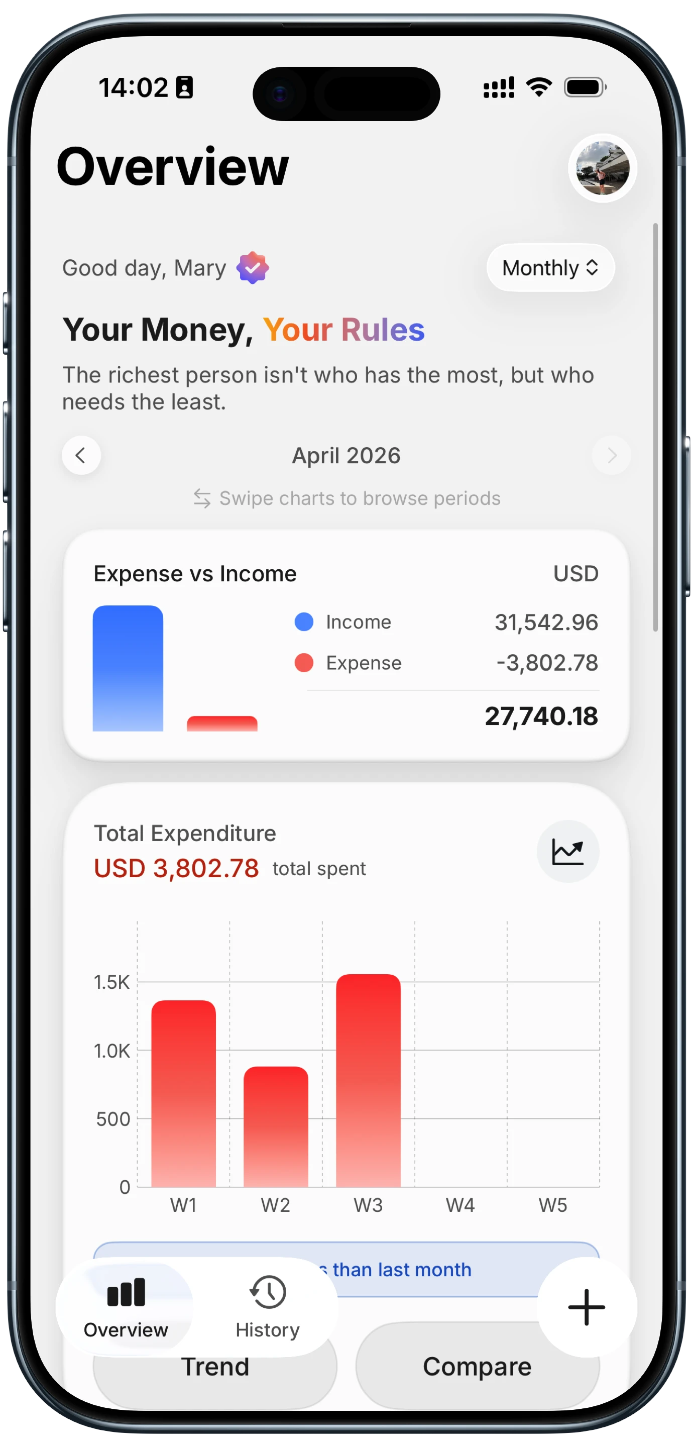
Open almost any finance app and money coming in is green, money going out is red. It is such a strong convention that most designers never question it. It is also, for roughly one in twelve men and one in two hundred women, the single worst pair of colors you could have chosen.
Red-green color vision deficiency is the most common form by a wide margin, and a chart that separates income from expense by hue alone gives those readers no separation at all. This guide explains why the convention persists, what actually makes a colorblind friendly budget app readable, a two-minute test you can run on any app before you subscribe, and what to look for in the settings. For the wider field of tools, our best expense tracker apps in 2026 guide is a good companion. For a wider look at design, our roundup of the best aesthetic budget apps compares how the most polished apps look and feel.
Why Finance Apps Default to the One Pair You Cannot Read
The red-green convention comes from accounting, where losses were written in red ink, and from stock tickers, which needed an instant up-or-down signal on low-resolution displays. Both predate any serious thinking about accessibility, and both were so widely adopted that the pairing now reads as neutral and obvious to anyone with typical color vision.
The problem is that red and green sit close together along exactly the axis that the most common deficiencies compress. Deuteranomaly and protanomaly, the two mild forms that make up most cases, shift red and green toward each other. Deuteranopia and protanopia, the stronger forms, collapse them almost entirely. What a designer sees as a vivid opposition can arrive as two near-identical muddy tones.
This matters more in finance than in most categories, because the information density is high and the stakes are concrete. A donut chart with fourteen slices, a bar chart with paired income and expense columns, a category list where overspending is flagged in red: all of these lean on hue to carry meaning, and all of them fail quietly. Nothing errors out. The chart just stops saying anything.
What Colorblind Friendly Actually Requires
The core principle is simple and it is the one most apps miss: color must never be the only thing carrying the information. If removing all hue from your screen would make it unreadable, the design has a problem.
There are four ways to add a second channel, and good apps use several.
Lightness. Two tones that differ in how light or dark they are stay distinguishable under every form of color vision deficiency, because lightness is processed independently of hue. This is the most robust fix available and the most underused.
Direct labels. A number printed next to a slice, or a category name on the bar itself, removes the need to match anything against a legend. Legends are where color-dependent charts do their worst damage, because they force a color-matching task that some readers simply cannot perform.
Shape and position. An arrow, a plus or minus sign, a consistent left-versus-right placement for income and expense. Any of these survives the loss of hue entirely.
Texture or pattern. Less common in modern interfaces because it looks dated, but genuinely effective in dense charts.
The Two-Minute Test
Before subscribing to anything, run this. It is faster than reading accessibility documentation, and it tests the actual product rather than the claim.
- Install the app and enter a handful of transactions, including at least one income entry and several expenses across different categories.
- Take a screenshot of the main dashboard and of the category breakdown chart.
- Convert both screenshots to grayscale, which any phone photo editor can do with a saturation slider.
- Try to read them.
If you can still tell income from expense, still match slices to categories, and still spot the overspent category, the app encodes information in more than hue and will work for you. If the grayscale version turns into an indistinguishable mass, no amount of settings will fix it, because the information was never there in the first place.
This test is useful even if you have typical color vision. An app that survives it is an app whose charts are legible on a bad screen, in bright sunlight, or printed.
Encoding by Lightness Instead of Hue
The strongest structural answer is a theme that has no hue to lose. If income and expense are separated by lightness alone, the separation is identical for every reader, because there is nothing for a color deficiency to compress.
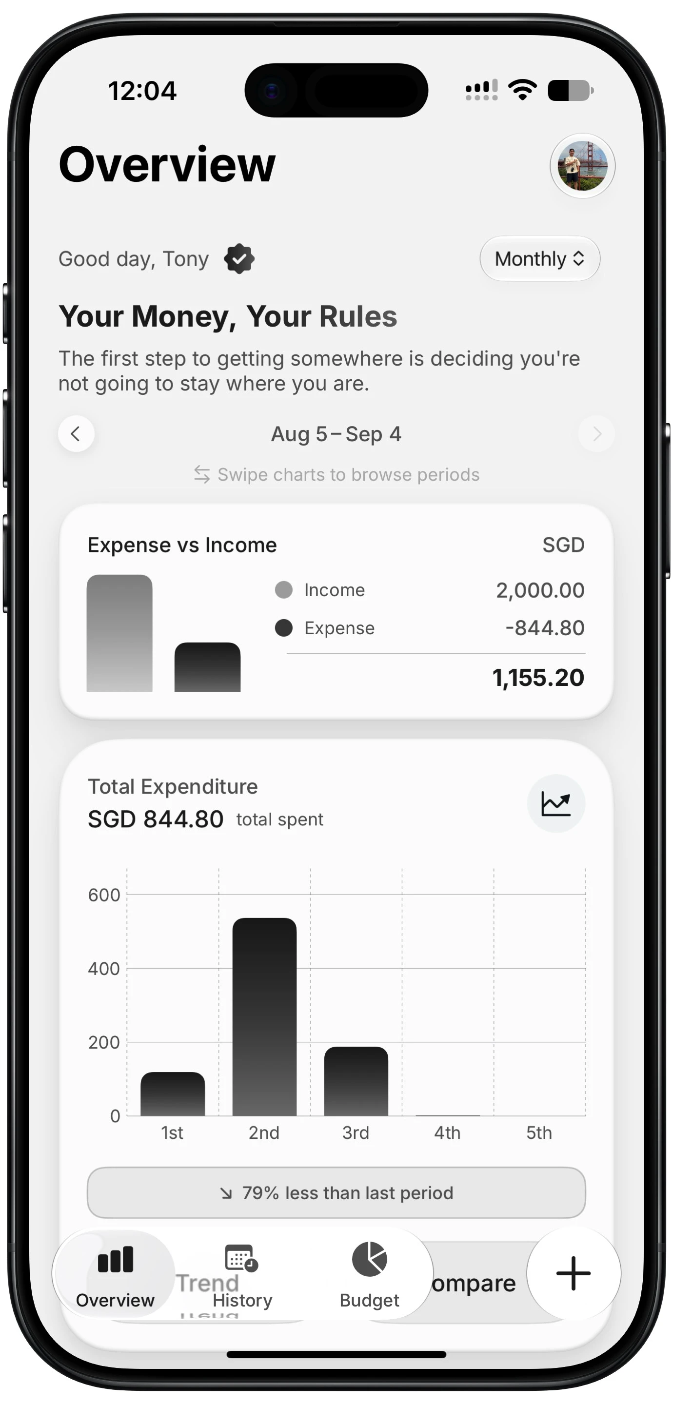
Finny app's Monochrome theme feature
Finny added a monochrome theme in its 1.17 release for exactly this reason, alongside its Classic, Garden and Coastal options. Income and expense are told apart by lightness, with expense as the heavier tone, and the category breakdown uses a ramp of evenly spaced lightness steps rather than a spread of hues. The practical consequence is that simulating red-green deficiency on it changes nothing: the distances that separate the elements are the same distances a reader with typical vision sees. A green-and-red pairing cannot make that claim.
It is worth being clear about what this does and does not solve. A monochrome theme is excellent for two-way distinctions and for charts with a handful of segments. It gets harder as segment counts climb, because lightness has less usable range than the full color wheel. Direct labeling matters more, not less, in a monochrome chart with a dozen categories. If your spending is spread thinly across many categories, consolidating them is worth doing on its own merits, and our guide to optimizing spending categories covers how.
What to Look For in the Settings
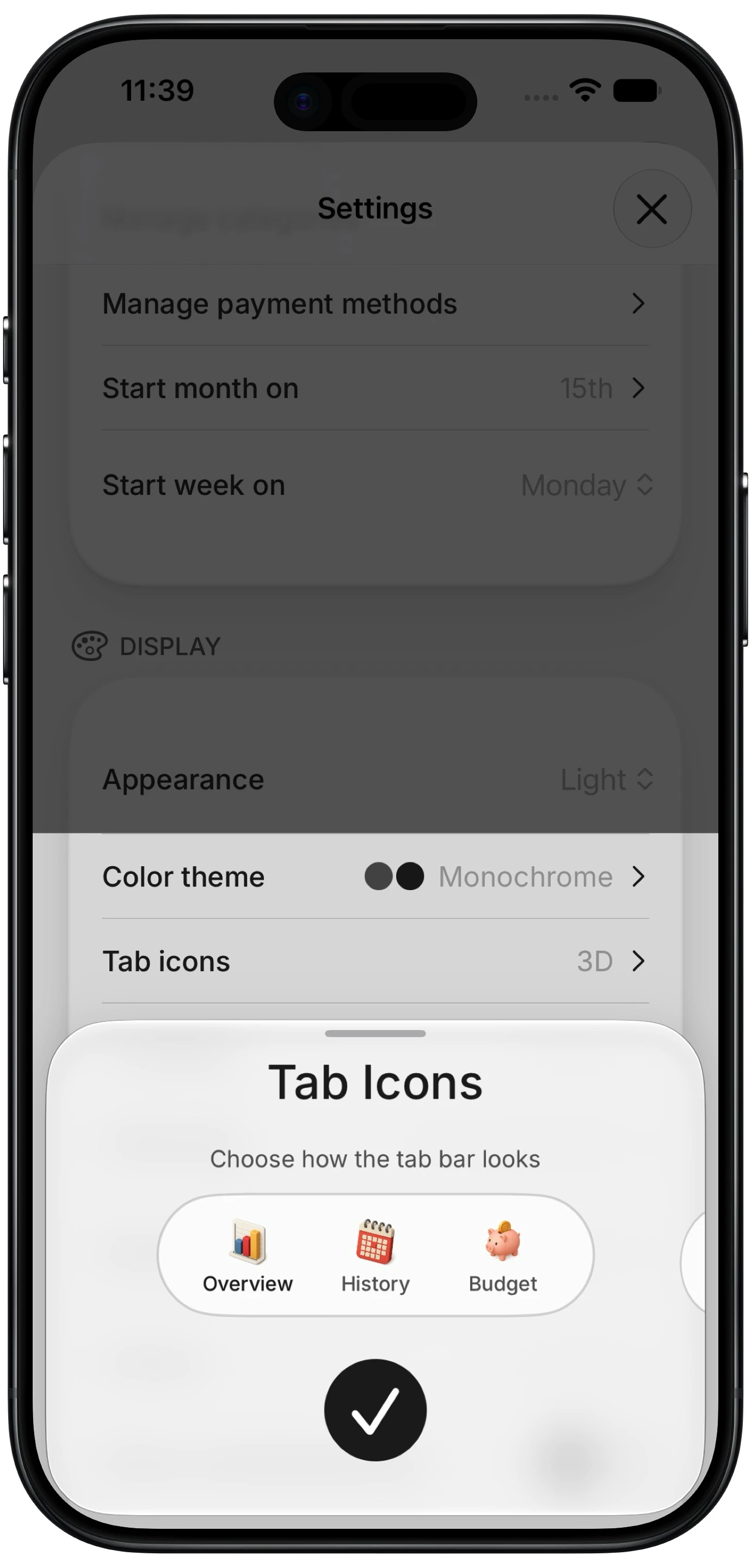
Finny app's custom tab icons feature
Beyond the grayscale test, these settings are the practical difference between an app you can use and one you fight:
- A theme choice that includes a low-hue or monochrome option. Not just light and dark, which change background rather than encoding.
- Numbers shown on charts by default, or an option to turn them on, so no legend matching is required.
- Category names on the chart itself rather than only in a color-keyed list.
- A sign or arrow on amounts, so a transaction reads as income or expense without reference to its color.
- System text size support, since many people managing one visual difference are managing others too.
Most mainstream budgeting apps offer light and dark modes and stop there. Theme choice that changes how data is encoded, rather than just the background, remains rare across the category, which is why the grayscale test is worth running rather than assuming.
Charts are only worth reading if the transactions behind them are complete. This clip shows how entries reach the app in the first place, logged from what is on screen rather than through a bank connection:
The Bottom Line
Colorblindness is not a niche consideration in finance apps. It affects roughly one in twelve men, and the exact color pair the entire category standardized on is the pair those readers cannot separate.
Run the grayscale test before you subscribe to anything. If an app survives it, it will serve you for years. If it does not, no settings screen will rescue it. And if you want the strongest version of the fix, look for a theme that encodes by lightness rather than hue, since that is the only approach that is identical for every reader by construction. If you are weighing options more broadly, our best money tracker apps in 2026 guide and our roundup of ad-free budget apps cover the field on other dimensions.
Common Questions About Colorblind Friendly Budget Apps
What percentage of people are colorblind?
Red-green color vision deficiency affects roughly 8% of men and 0.5% of women of Northern European ancestry, which works out to about one in twelve men and one in two hundred women. Milder forms, deuteranomaly and protanomaly, account for most cases and shift red and green toward each other rather than removing them. Blue-yellow deficiency and full monochromacy are far rarer.
Does dark mode help with colorblindness?
Not by itself. Dark mode changes the background and overall brightness but usually keeps the same hue coding for data, so a red-versus-green chart stays exactly as hard to read. It can help with light sensitivity and eye strain, which is a genuine benefit, but it is a different problem. What helps is a theme that changes how information is encoded, not one that changes what sits behind it.
How do I test if an app works for colorblind users?
Screenshot the dashboard and the category chart, convert both to grayscale in any photo editor, and try to read them. If you can still separate income from expense and match segments to categories, the app encodes meaning in lightness, labels, or position rather than hue alone. If the grayscale version is unreadable, the information was only ever in the color and no setting will recover it.
Are budget apps required to be accessible?
Consumer mobile apps generally sit outside the strict legal requirements that apply to government and many enterprise products, so most compliance is voluntary. Accessibility guidelines are clear that color should never be the sole means of conveying information, but enforcement for a personal finance app on an app store is effectively nonexistent. In practice you have to test rather than assume, which is why the grayscale check is worth two minutes.
Ready to read your own charts?
Download Finny and switch to the monochrome theme, where income and expense are separated by lightness rather than color. No bank connections, offline support, and full control over your financial data.